- 06 Aug 2024
- 5 Minutes to read
Plot types in Flowvis
- Updated on 06 Aug 2024
- 5 Minutes to read
A number of different plots are available in Flowvis:
Scalar Time
2D Cut Plane
3D Plot
Scalar Line
Boxplot
Exceedance 1D
Jump Table
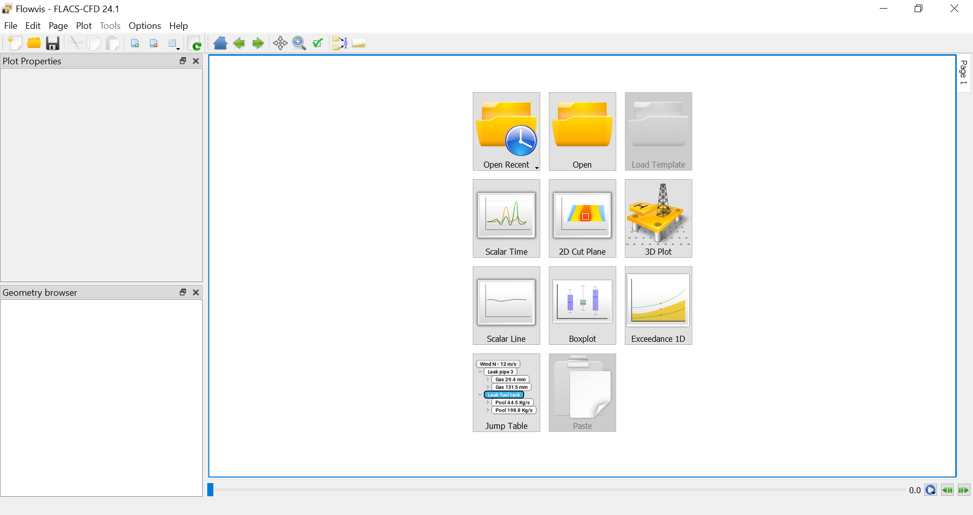
Shortcuts for the plot types are shown in the plot area upon opening Flowvis, as shown below.
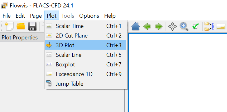
Plots can also be selected via Plot in the menu bar, as shown below.
Scalar Time
Variables can be plotted over the simulation time. Outputs for several simulations, monitor points, monitor regions and panels can be visualised on the same plot. Multiple variables can also be selected.
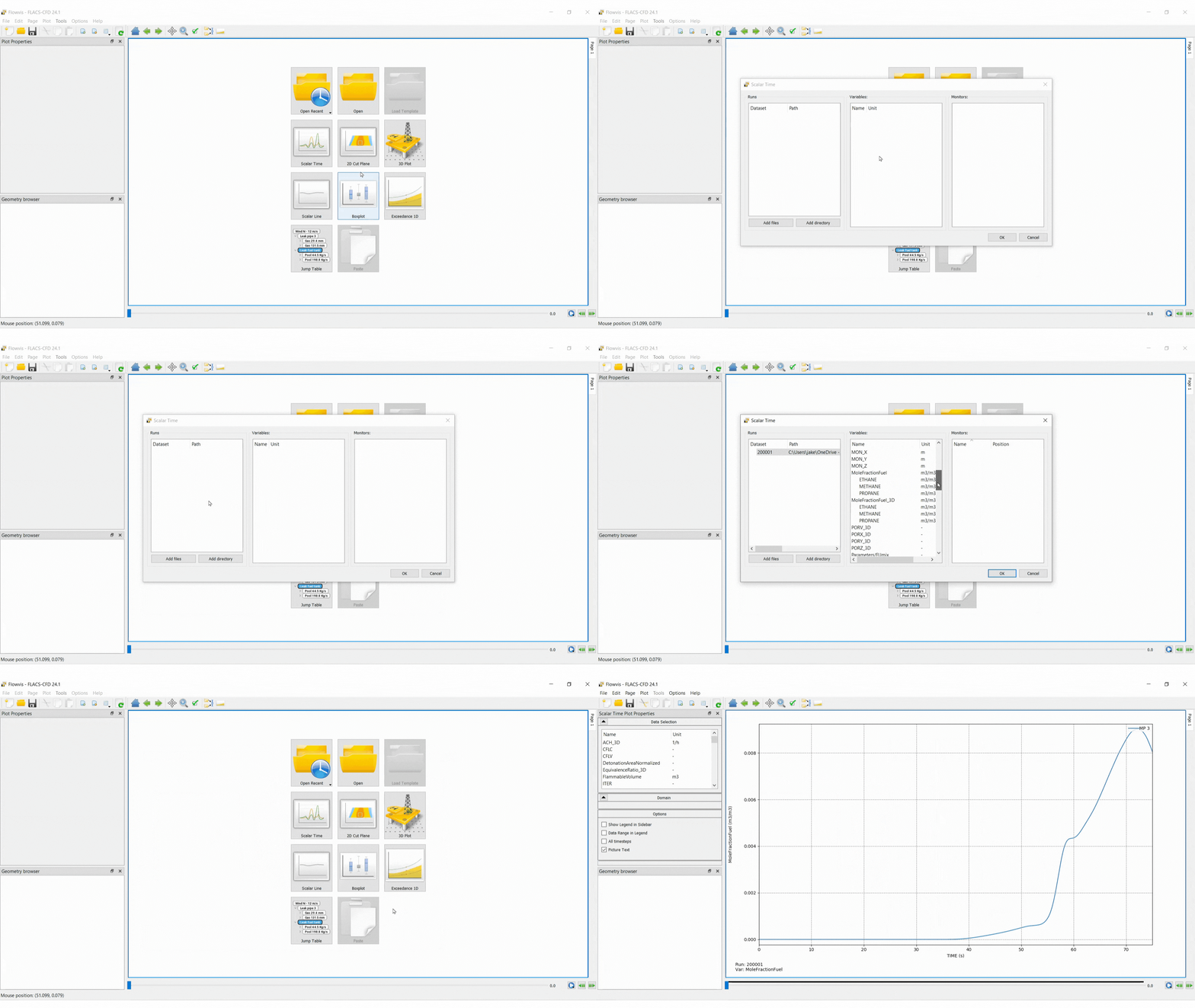
To create a Scalar Time plot select the Scalar Time icon.
Add a dataset: select Add files, navigate to the results file and open it in Flowvis
Select variables
Select monitors
Note that multiple datasets, variables and monitors can be selected simultaneously by holding Ctrl and selecting.
The Scalar Time pop out menu can be accessed by right-clicking on the graph area and selecting Data Selection.
2D Cut Plane
The 2D cut plane plot type shows a cross-section of the results parallel to a grid plane. The plot can include output for none, one or two variables. If two variables are combined, one must be a scalar and the other must be a vector.
Scalar variables are shown using filled contours while vector variables are displayed with arrows.
The grid, geometry and porosities can also be shown.
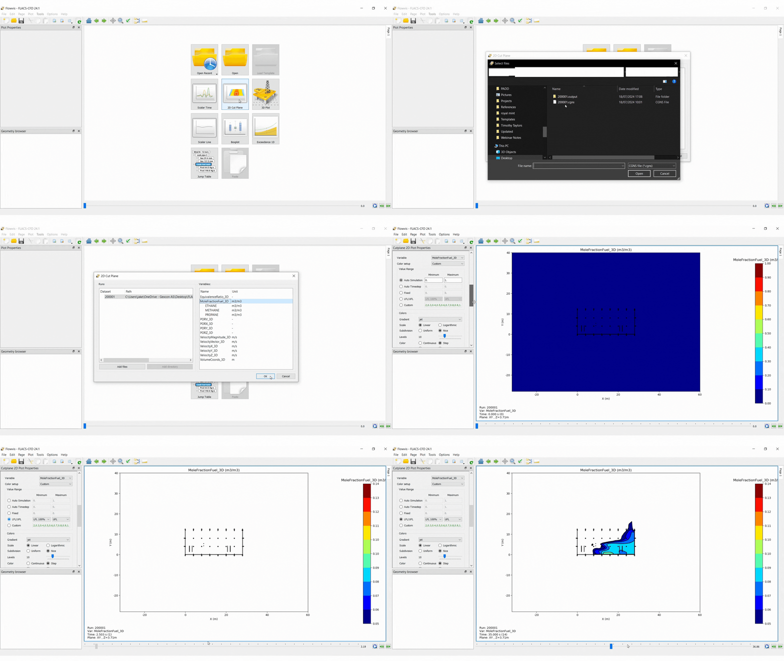
To create a basic 2D cut plane plot, the following steps should be taken:
Select the 2D Cut Plane icon in Flowvis
Add a dataset: select Add files, navigate to the results file and open it in Flowvis
Select variables to be output and click OK
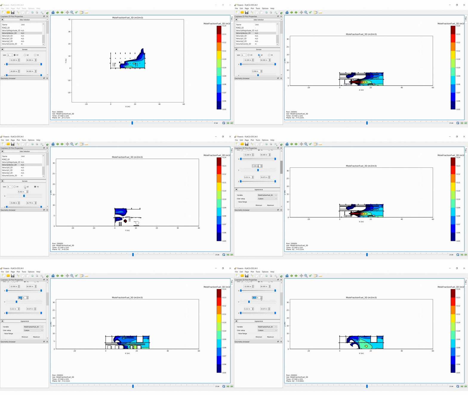
Select the plane orientation: XY, XZ or YZ
Select the domain section to be visualised using the sliders or entering values
Change the appearance of the data for the active plot
Use the time slider to navigate through the time steps
Options
Data Selection: different variables can be selected from the list
Domain:
Plane direction: XY, XZ or YZ
Domain boundaries: minimum and maximum values must be defined for two axis (those in the plane selected) and one position defined for the third dimension, where the cut plane will be located.
Appearance: under appearance, the colours applied to the data can be modified
Variable: select the variable to modify the data presentation
Value Range: select the range for data values to be mapped onto the selected colour gradient
Auto Simulation: uses the range from the minimum to the maximum value for the chosen variable across all time steps
Auto Timestep: range based on the current time step
Fixed: a range must be entered manually, divisions between the upper and lower bounds are fixed
LFL/UFL: sets the range based on the LFL and UFL (only available for some variables)
Custom: the user specifies a list of values for the colour intervals (values entered should be separated by commas)
Gradient: the colour range that values will be mapped to
Levels: used to specify the number of discrete colour steps and contours
Colour:
Continuous: data values are mapped to a continuous range of colours
Step: data values are mapped onto discrete colours
Contour filling: determines whether contours are filled with colour
Contour outline: determines whether contour lines are plotted
Values < Min:
None: values below the minimum specified in the range are not coloured
Same: values below the minimum specified in the range are coloured the same as the lowest colour step
Values > Max:
None: values above the maximum specified in the range are not coloured (can be useful when wanting to plot LFL-UFL range only)
Same: values above the minimum specified in the range are coloured the same as the highest colour step
Options: a number of self explanatory options are provided to display specified features
Figure options: accessed via Edit → Figure options or via right-clicking and selecting Figure options. Can be used to define plot titles and range, label and scale of the axes.
3D Plot
A 3D Plot shows a three-dimensional representation of the geometry and simulation results.
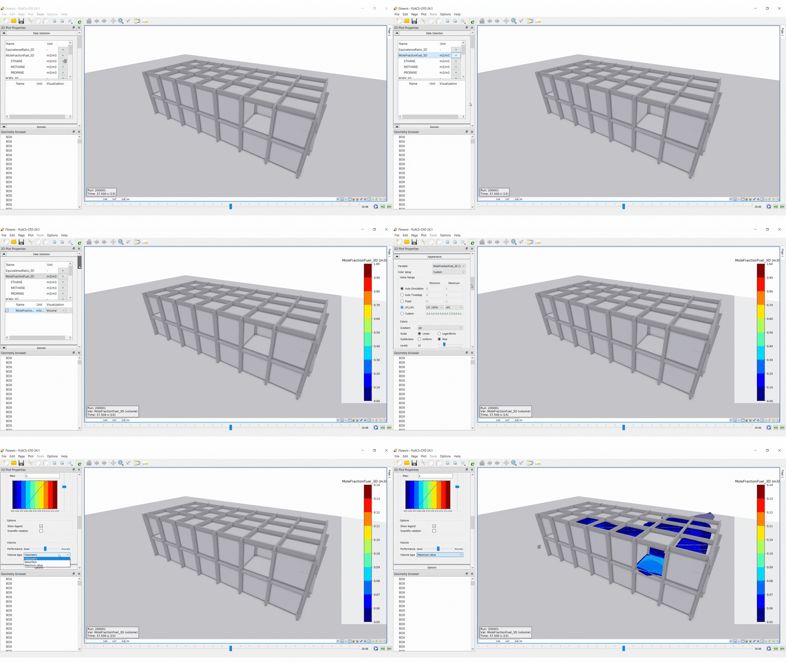
To create a basic 3D plot, the following steps should be taken:
Select the 2D Plot icon in Flowvis
Add a dataset: select Add files, navigate to the results file and open it in Flowvis
Select variables to be displayed under Data Selection
Set the Value Range in Appearance
Set Volume type in Appearance for better visualisation
Use the time slider to navigate through the time steps
The 3D view can be manipulated with the mouse (functions such as rotate, zoom and pan can be performed the same as in CASD)
Options
Data Selection:
Unit: option to change the unit displayed for the variable
Visualisation:
For scalar variables, four visualisation modes are available:
Volume: the data is visualised in the form of a “cloud”.
Surface: the data is visualised as filled contours on the geometry.
Isosurface: semi-transparent surfaces indicate the locations where the variable assumes specific values.
2D slice: the data is visualised as filled contours on axis-aligned planes.
For vector-valued variables, the following visualisation modes are provided:
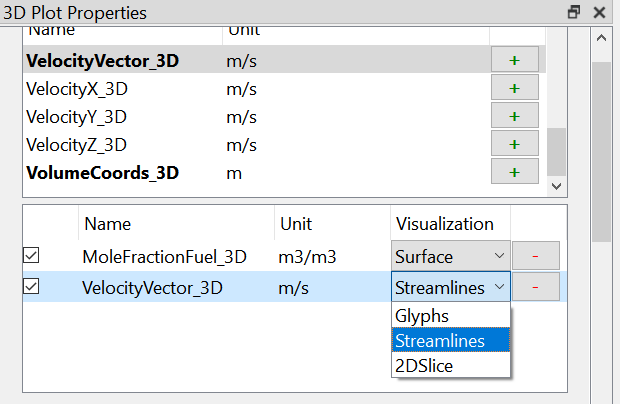
Glyphs: the direction and magnitude of vectors are displayed using arrows.
Streamlines: curves tangent to the vector field convey the direction of the flow.
2D Slices: axis-aligned planes slicing through the vector field.
Domain: minimum and maximum values defined for each axis
Appearance:
For volume and surface visualisations, see Appearance in the 2D cut plane section above.
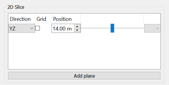
2D Slice: Accessed by selecting 2DSlice in the Visualisation drop down menu
Select Add plane in the 2D Slice section of the Appearance menu
The direction and position of the plane can then be modified
The transparency of the slice can be modified in Transparency in the Appearance menu
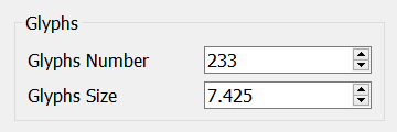
Glyphs: when vector data is selected, data can be visualised as glyphs. The number and size of glyphs can be controlled using the inputs Glyphs Number and Glyphs Size in the Appearance menu (as shown below). The size of the glyphs can also be altered by changing the Transparency settings in Appearances.
Streamlines: The number, radius and integration time (length) of the streamlines can be set in the dialogue. In addition, you can choose whether the integration should be backward in time, forward in time, or both.
.gif)
Scalar Line
A scalar line plot is a 2D cartesian plot of a scalar variable, sampled along a straight line running through the simulation domain. To create a simple Scalar Line plot the user should:
Select the Scalar Line icon in Flowvis
Add a dataset: select Add files, navigate to the results file and open it in Flowvis
Select variables to be displayed under Data Selection
Select the axis in which the line will follow
Set the start and end position along the chosen axis
Set the position of the line in the other two axes
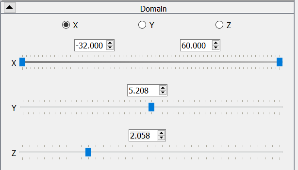
The resulting plot will then display the value of the variable along the line of interest.


