- 04 Sep 2024
- 3 Minutes to read
Evaluating the risks of increased population near industrial zones
- Updated on 04 Sep 2024
- 3 Minutes to read
Introduction
As the population expands, residential areas advance increasingly upon industrial zones. This article explores the application of RISKCURVES for scenario comparisons and population adjustments, enhancing the precision and efficiency of your Quantitative Risk Assessment (QRA) studies to inform decisions regarding urban development.
Scenario
In scenarios where the current population distribution already poses specific risks, plans for urban development introducing new residential complexes can exacerbate these risks. This area also includes a swimming pool at a sports facility with chlorine supplies and an inland waterway LPG transport. This complex risk landscape requires a robust tool for assessing the impact of increased population density on overall safety. By leveraging RISKCURVES, you can generate, modify, and compare detailed population scenarios, facilitating a comprehensive risk analysis.
Process overview
1 Modify population distribution
Each calculation set allows you to define a population distribution separately. You can create multiple sets with different scenarios to account for population changes. Begin with a risk calculation based on the current population distribution. Use RISKCURVES’ functionality to duplicate this calculation set and then efficiently add new population scenarios as needed:
Duplicate the current calculation set for a new scenario (click on calculation set and press Ctrl+C, Ctrl+V) and rename it (press F2).
To this exact copy of your calculation add a new population distribution (see define population distribution). For this case, we will add a new building complex as a population polygon.
Draw the shape of the building or area on a map and define the planned population.
When the polygon shape is finished, click done and calculate.
Now you ended up with 2 calculation sets. One reflecting the current population distribution and one reflecting the planned population increase.
.gif)
Add new calculation set with increased population
The increase in population will be reflected in the Societal Risk results presented as the fN curve and Societal Risk maps. Now you can evaluate if the increase in population in this area will have a significant impact on the Societal Risk, if risk will be acceptable and what scenarios are contributing the most to the total risk.
2 Comparative risk evaluation
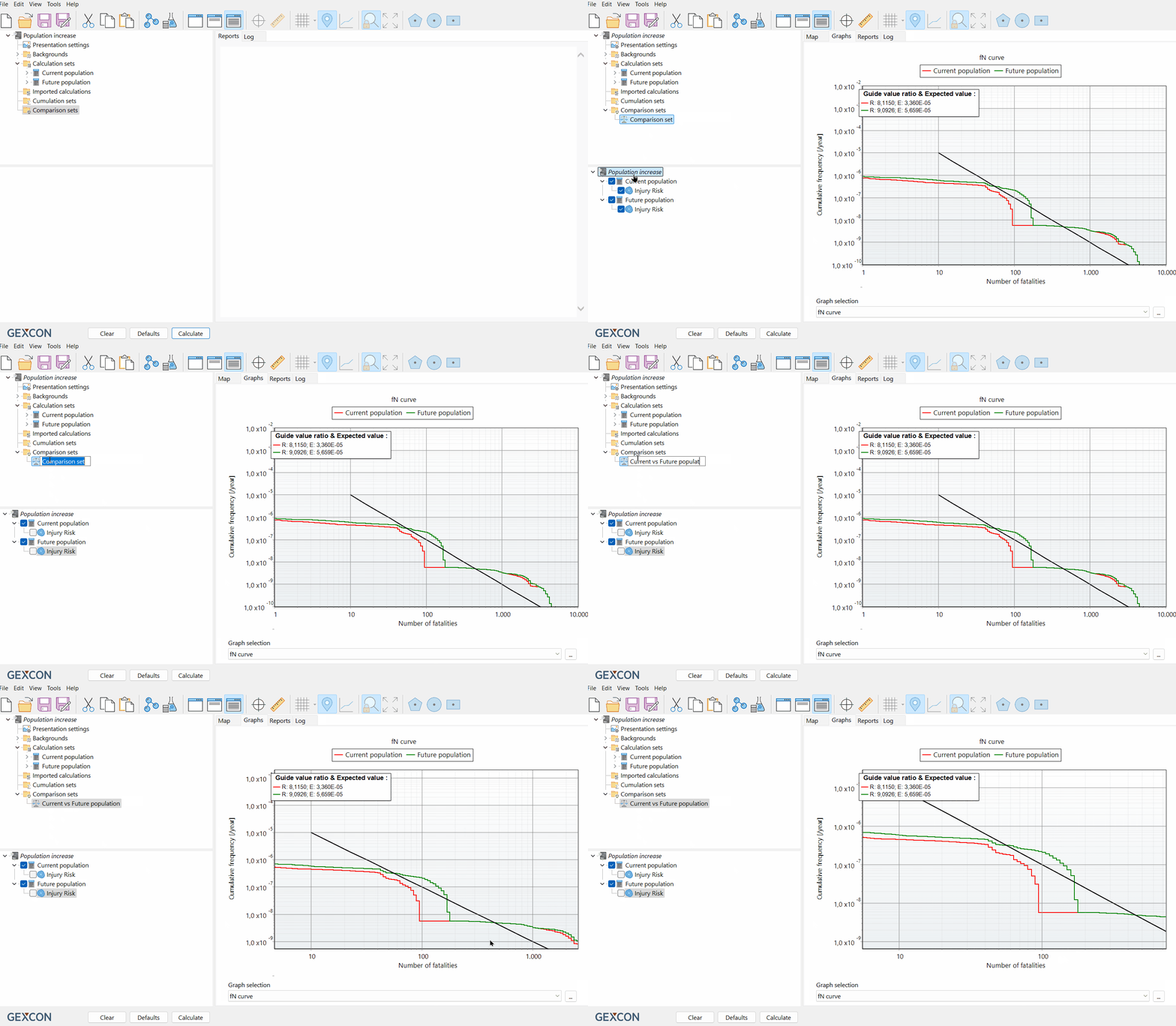
Use the comparison set feature to analyse differences in scenarios. This enables a straightforward comparison of risk acceptability across scenarios, displaying results in both graphical (Societal risk as fN curve) and map formats (Individual risk as iso risk contours).
Create a comparison set.
Select relevant calculation sets in the input panel and compare the results. For this case "Current population" and "Future population".

Comparing current vs future population
3 Identification of high-risk areas
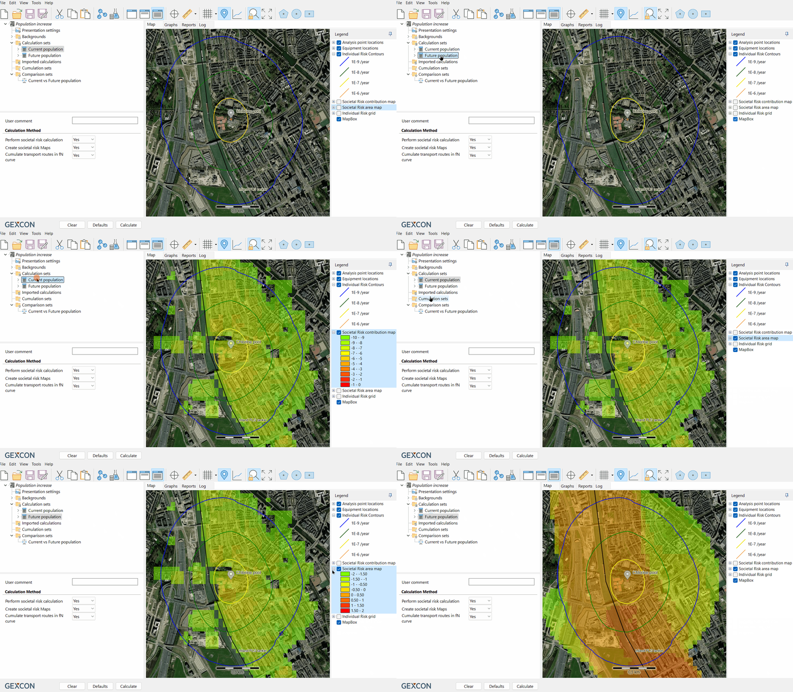
The SR Area Map exposes areas exceeding SR acceptance criteria. The colour shows how much the value exceeds the limit at the coordinate, illustrating Societal Risk ranging from low (green) to high (red), where red grids indicate that the risk acceptance criterion is surpassed at the location (fN curves are above guide value).
The SR Contribution Map is a geographical representation of which areas contribute the most to the Societal Risk. It shows the “hotspots” that might potentially pose a threat in terms of Societal Risk and that need attention.

Identify critical areas during societal risk maps
Tip
Export contour or SR maps and make risk visualisation in Google Earth.
Download the project file
Take a look at the Societal Risk calculation in RISKCURVES and evaluate if the risk will be acceptable in an urban zone after the population increase.
To view the project file, please open it using the RISKCURVES software. If you don’t have the software, you can download and use the free viewing demo version of RISKCURVES via the link below.

